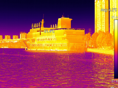
Thermal imaging is a technology used to visualize heat patterns, which is crucial in various industries such as building inspections, medical diagnostics, and surveillance. One of the key aspects of thermal imaging is the use of pseudo color to represent temperature differences.
Pseudo color enhances the clarity and contrast of thermal images. By assigning specific colors to specific temperature ranges (e.g., blue for cooler areas and red for hotter areas), pseudo color provides a more intuitive and visually striking way of understanding heat patterns. This makes it easier for operators to identify potential issues such as overheating components, energy loss in buildings, or medical abnormalities.
1. White Hot
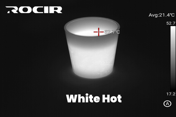
The White Hot palette is one of the most commonly used in thermal imaging. In this mode, hotter areas appear brighter, while cooler areas are darker. This grayscale representation is simple yet effective, making it ideal for general applications such as surveillance and search-and-rescue operations.
Best for: General-purpose imaging and outdoor thermal surveillance.
2. Lava
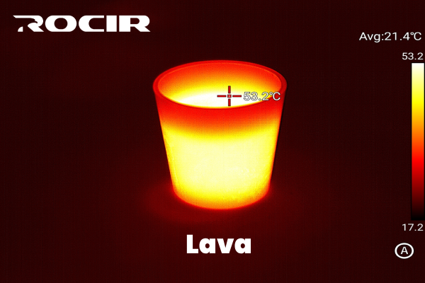
The Lava palette uses deep reds, oranges, and yellows to depict heat, mimicking molten lava. Cooler areas are often dark, creating high-contrast images. This palette is particularly effective for identifying hot spots in industrial settings or electrical systems.
Best for: Hot-spot detection in industrial and electrical inspections.
3. Iron Red
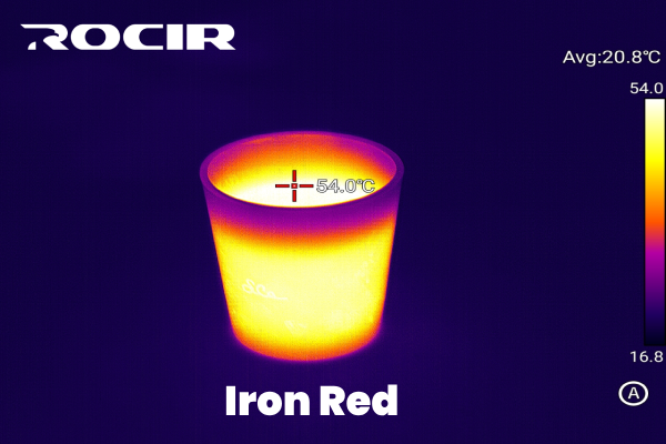
Iron Red employs a gradient of red, yellow, and black to emphasize heat variations. It is highly intuitive, as it mirrors how humans naturally perceive heat, making it a popular choice for building diagnostics and maintenance.
Best for: Building inspections and HVAC system evaluations.
4. Hot Iron
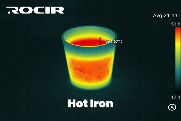
The Hot Iron palette is similar to Iron Red but offers greater contrast, with blue or black for cooler temperatures and vibrant yellows or whites for the hottest areas. This high-contrast visualization is excellent for pinpointing temperature extremes in technical applications.
Best for: Industrial inspections and scientific research.
5. Medical
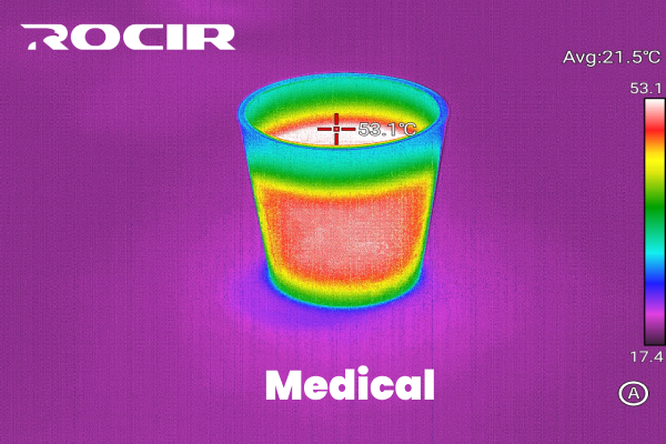
The Medical palette focuses on highlighting subtle temperature variations, making it perfect for applications where precision is critical. It often uses shades of blue and green for cooler areas and red for warmer areas, ensuring clear differentiation.
Best for: Medical diagnostics, such as detecting inflammation or circulatory issues.
6. Arctic
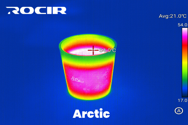
The Arctic palette provides a cool-toned gradient, often using blues, purples, and whites. It’s designed to offer a calming visual effect while maintaining clarity, making it suitable for environments where aesthetics are important.
Best for: Aesthetic or non-technical applications, such as presentations or public displays.
7. Rainbow 1
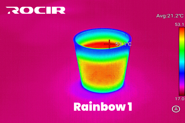
Rainbow 1 is a vibrant palette that uses a full spectrum of colors, ranging from violet to red. This palette is ideal for applications requiring detailed thermal analysis, as it provides clear differentiation between small temperature variations.
Best for: Scientific research and detailed thermal mapping.
8. Rainbow 2
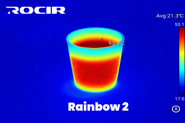
Rainbow 2 is a variation of Rainbow 1 but offers smoother gradients for a less dramatic effect. This makes it more user-friendly for general-purpose thermal imaging while still providing clear heat differentiation.
Best for: General-purpose imaging with a focus on detailed yet smooth visualization.
9. Tint
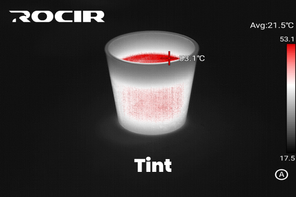
The Tint palette applies a single dominant color (often shades of blue or green) to represent cooler temperatures, with warmer tones like yellow or orange for hotter areas. It’s useful for creating visually appealing images with moderate contrast.
Best for: Aesthetic applications or when a subdued color scheme is preferred.
10. Black Hot
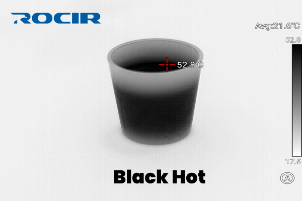
In the Black Hot palette, hotter areas appear darker, while cooler areas are brighter. This is the inverse of White Hot and is especially effective in environments with high background noise, such as during nighttime surveillance.
Best for: Night-time security and law enforcement applications.

